Copyright Notice: This article is Copyright AI Factory Ltd. Ideas and code belonging to AI Factory may only be used with the direct written permission of AI Factory Ltd.
In a previous article Modular Graphics for Move it! the issue of optimising graphic assets was considered. That article looked at how to flexibly and efficiently allow a large number of possible shapes to be rendered using a limited set of components. This article instead considers colour control. Typically most games deal with colour as a hardwired exercise of creating a set of assets that have a fixed role, or that can be swapped in response to option or level setting. This is generally a simple block swapping of assets or perhaps selection of assets in response to direct user selection of components (such as customised avatars).
In both Move it! and Sticky Blocks however a bigger issue occurred. The game consists of hundreds of puzzles with between 4 and 20 pieces per puzzle, each of which might be rendered in a different way. Hardwired level colour design would have been a substantial undertaking, but more critically, a very inflexible approach.
We instead chose an algorithmic approach to dealing with this, as follows:
The Background
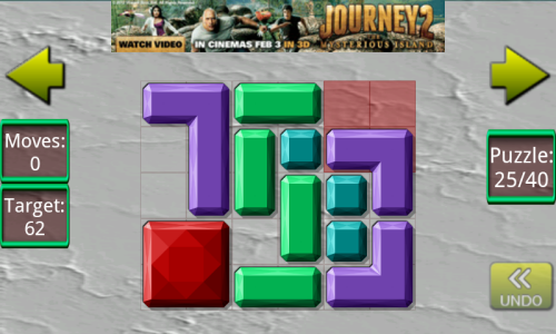
From the previous article articles it can be seen that Move it! (and Sticky Blocks) puzzles consist of groups of coloured shapes that needed to be manipulated to solve the puzzle. Since both of these puzzles have 600 levels, which is a substantial body of puzzles to be prepared. If you consider some puzzles, such as Unblock me (a well known "Rush Hour" clone), you will see that colouring or texturing these pieces for these is not an issue as all pieces are exactly the same colour and texture. This is an approach we could have taken with Move it! and Sticky Blocks, but this would limit you to relatively dull puzzles visually.

We made the decision that puzzles needed to be multi-coloured so that they were more visually interesting. Having committed to doing this we might have been faced with a substantial manual task colouring all these puzzles. Within these puzzles, given the variety of shapes, there was always going to be opportunity to link colour and shape in some regular fashion. If that was a fixed decision at the onset (e.g. make all "L" shapes cyan) then, as the puzzle set developed, this might create a series of unattractive combinations as puzzles changed layout later in the series. Also such uniformity might also make futures puzzles seem rather predictable and therefore lacking in variety.
Finally, even a "good" initial design plan would over commit you. Any desire to freshen or rework would mean starting all over again.
Commit to Colour Coding
Of course a first easy step to avoid committing to particular colours is to use coded colours for each item, so that object "x" would be colour 5, not cyan. That allows you to refine later on what "5" actually maps to. However this would allow you to simply juggle what colour an entire block of shapes was. So "L" shapes might initially be cyan, but later swapped so that all "L" shapes were green.
This base offers a chance of flexibility, but actually still rather limited, so we took this further.
Algorithmic Colour Coding
Ideally, to get a nice looking puzzle, it would be better to control colours using some defined set of rules. If the Puzzle has many 1x1 blocks, and a few other shapes, it is probably unattractive to have the 1x1 shapes using a variety of colours. However a puzzle might only have 6 pieces using just one shape, in which case it makes some sense to use different colours within the same shape just to avoid the puzzle looking bland. At the other extreme a puzzle may have 8 different shapes for 12 pieces, in which case the opposite may occur and groups of shapes might be best assigned to the same colour, so that the puzzle is not just a mess of colours.
Using colour well not only is generally aesthetically desirable, but also can be used to give the puzzle some visible structure. If colours are random then puzzles will all look basically similar. If there is some pattern of colour allocation then the colouring can reveal the individual structure of that puzzle.
So the plan was to instead provide an algorithmic approach to colour coding.
Table-driven Colouring
The puzzle defines series of 21 shapes, each of which can have up to 4 different rotations, giving 69 possibilities. Each colour required a set of 20 components that would allow all possible 69 shapes and rotations to be rendered.
The last degree of freedom is the number of available colours. For Move it this was 7. Given that this was going to be algorithmic there was merit in making this general, so colours could be added or taken away.
The structure of this was to be dynamic in that the colour scheme for any puzzle would be determined at the point at which that puzzle was selected. The basis of colouring was to attempt a series of colouring schemes, starting with most demanding in terms of the number of colours used, and rejecting those that could not be achieved with the colours available, until a tested scheme worked. The schemes used were as follows:
| // 1. | one colour per piece, except 1x1 square pieces which are all one colour. | |
| // 2. | group pieces that are same shape, but rotated, to share colours, except horiz<>vert bars | |
| // 3. | group pieces that are same shape, but rotated, to share colours | |
| // 4. | group classes of shape together, e.g. bars, 2x2sq, L's, zigzag's, jig+star, T+U (5 groups) | |
| // 5. | divide shaped pieces down to into one of 3 types + single : bars, L's + 2x2 square, (zigzag's + jigsaw + star + T + U) (3 groups) |
|
| // 6. | divide shaped pieces down to into one of 2 types + single : bars, (L's+2x2 + zigzag's + jig+star + T+U) (2 groups) |
|
| // 7. | all shapes are the same colour (still different to 1 sq pieces, which have a unique colour) |
Scheme "1" above specifies that all 1x1 squares have a single colour but that each other piece on the board is in another different colour. That can easily run out of colours.
Scheme "2" groups pieces that are the same shape, but rotated, to have the same colour, except vertical and horizontal bars, which are simple rotations, but treated differently.
As you progress down the list, then the schemes start to group shape types together, for example bars and squares, since these are both simple shapes. This makes aesthetic sense, so that shapes with common features are treated the same way. This helps to highlight and emphasise the structure of the puzzle.
The final scheme, if all else fails, paints 1x1 in one colour and all other shapes in another colour.
Choosing what colours get selected
The above scheme simply determines which scheme can be used with the number of colours available. It makes no distinction for which colours should be allocated to which group. This could be random, but that is almost certainly a bad idea.
A better scheme would be to figure out which shapes look best with which colours. To do this the program has the following table:
| // | preferred colour scheme to use for shape | |||||||||
| // | 1 | 2 | 3 | 4 | 5 | 6 | 7 | 8 | ||
| // | cyan, | yellow, | blue, | green, | purple, | orange, | pink, | red. | ||
| const TInt8 KColourScheme[][8] = { | ||||||||||
| // KColourScheme[shape][scheme-1] | ||||||||||
| /////////////////////////////////////// | bar | |||||||||
| // EShape_3x3_Jigsaw_1, | ||||||||||
| // col | G1 | G2 | G3 | G4 | G5 | G6 | G7 | |||
| { 2, | 0, | 3, | 3, | 2, | 2, | 8, | 1 }, | |||
| // EShape_1x5_bar_2, | ||||||||||
| // col | G1 | G2 | G3 | G4 | G5 | G6 | G7 | |||
| { 3, | 0, | 22, | 1, | 1, | 1, | 1, | 1 }, | |||
| … | ||||||||||
| … | ||||||||||
| } | ||||||||||
This table has a lead element, which is the preferred colour for this shape (1-7), if that colour is not taken. The following elements G1 to G7 identify which other shape 1->69 that this shape should be grouped with for colouring schemes G1->G7. If this is zero, it is not grouped and therefore unique. This potentially changes with each changing scheme, with eventually all elements for all shapes having a final "1" entry, indicating that they share the same group as all other shapes. This table then allows the renderer to determine how many distinct groupings are present in the puzzle. If this is more than the available colours, then that scheme is rejected.
The Colouring Algorithm in use
The above colouring alorithm attempts to use as many colours as it can but intelligently groups similar shapes where needed. This results in colourful puzzles but with optimised grouping so that the structure of the puzzle is clear.
This is logically ideal and aesthetically satisfactory as colours are in harmony with actual puzzle structure.
This is the scheme used for the first few versions of Move it!, but still had flaws, as follows:
Defining colour-coordinated Schemes
The above was fine, but still had an inclination to combine clashing colours. The "better" colours were more often chosen in the table above so that the least agreeable colours were most likely to be excluded from the scheme chosen. Note that the chosen scheme that could be used within the colour limitations would probably not use all colours. I.e. the previous "failed" scheme might have needed 9 colours with only 7 available, but the first less-demanding scheme less than or equal to 7 might only need 5.
The next step was to have a randomisation, seeded by puzzle number, which
selected one of a number of colour coordinated sets. A table was used for
this, as follows:
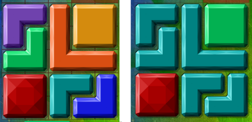
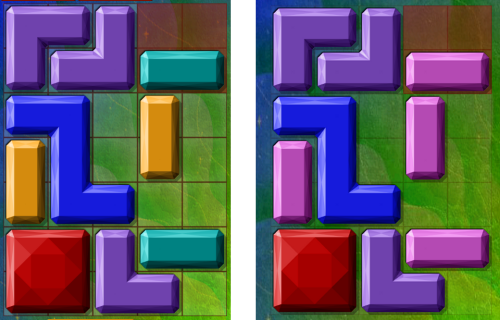
Each of these sets above only had a maximum of 3 colours, so this was directing the colouring to use much more restricted colour sets. However any puzzle with 5 or less pieces and a further 10% of all puzzles were allowed to use all colours. Overall this resulted in more harmonious colour schemes, which can be seen below in the old and newer versions of Move it!

Above has reduced the 6 colours (excluding red base piece) to just 2.

In the above the colour set is reduced only from 4 to 3, but controlled colour selection and again more harmony.
Note that the two left hand old puzzles above seem similar as they both have many colours. The two right hand new versions of the same puzzle feel more distinct. The colour scheme appears more designed.
Conclusion
The above scheme allowed quick experimental re-colourings with just a couple of code changes. This ease of experiment encourages the creation of better colour sets as more things can be tried more quickly. The same scheme was tried for Sticky Blocks and in the latter the colour set was later reduced from 7 to 6 (excluding red). This was a one-line change, but impacted the auto-render of some 600 puzzles.
Overall this was a successful experiment in colour design control.
Jeff Rollason - February 2012
